AI Code Review
PR Sequence Visualization: From Code Diff to Runtime Flow

Sonali Sood

Founding GTM, CodeAnt AI
You're staring at a 47-file pull request, and the diff tells you exactly what changed—but not what happens when that code runs. The reviewer's dilemma: you can see every line addition and deletion, yet the actual runtime behavior stays invisible.
PR sequence visualization solves this by translating static code changes into diagrams that show execution flow. This article covers the technology behind that transformation—from AST parsing to AI-generated summaries, and how engineering teams use it to review faster and catch bugs earlier.
What is PR Sequence Visualization?
PR sequence visualization connects static code changes to dynamic execution behavior. When you open a pull request, you see a diff—lines added, lines removed, lines modified. But that diff doesn't tell you what happens when the code actually runs. PR sequence visualization fills that gap by generating diagrams that show the runtime flow introduced or modified by your changes.
Here's the core idea: a diff shows what changed, while a sequence visualization shows what happens when that code executes. The diagram captures which modules interact, in what order, and where key decision points occur. For reviewers, this means a quick, high-signal glance at the PR's real impact without mentally simulating execution across multiple files.
Why Traditional Code Diffs Fail to Show Runtime Impact
Standard diff views in GitHub, GitLab, Azure DevOps, or Bitbucket display line-by-line text changes. They're great at showing what changed but offer no insight into when or how often that code runs.
Static diff views show changes but not execution paths
A diff presents additions in green and deletions in red. What it doesn't show: that new function gets called inside a loop running 10,000 times, or it only executes when a specific error condition triggers. The execution context stays invisible.
Hidden control flow creates review blind spots
Conditional logic, loops, and exception handling create multiple execution paths. Diffs flatten all of this into a single textual view. You might see a new if statement, but you won't see the five different scenarios that determine which branch runs.
Cross-module effects get lost in line-by-line reviews
Changes in one file often ripple through imports, dependencies, and shared utilities. Diffs isolate changes per file, so you're left mentally stitching together how a modification in auth.js affects checkout.js three directories away.
How Code Diffs Transform Into Execution Flow Diagrams
The transformation from diff to diagram follows a technical pipeline. Understanding this process helps you evaluate which tools work best for your codebase.
Parsing changed files to identify affected code paths
Tools start by parsing the abstract syntax tree (AST) of changed files. An AST is a tree representation of source code structure—it captures functions, classes, variables, and their relationships without formatting noise or comments. The parser identifies which functions, classes, and methods were modified in the PR.
Mapping function calls and branching logic
Next, the system traces call relationships outward from modified code. If you changed function A, and function A calls functions B and C, the tool builds a graph of those connections. Conditionals and loops create branches in this graph, representing different paths execution might take.
Rendering visual representations of runtime behavior
Finally, the graph data becomes a diagram. Sequence diagrams work well for time-ordered interactions between components.
Flowcharts suit decision-heavy logic with multiple branches. The rendering step transforms abstract relationships into something you can scan in seconds.
Technologies That Power Runtime Flow Analysis
Three analysis approaches drive PR flow visualization. Each has tradeoffs worth knowing.
Static analysis for structural code understanding
Static analysis examines code without executing it. It detects function signatures, dependencies, and control structures by reading source files directly.
Advantage: Works on any code without instrumentation or test runs
Limitation: Shows potential paths, not actual runtime behavior
Dynamic analysis for capturing runtime behavior
Dynamic analysis observes code during execution. It captures real call sequences, timing, and data values by running tests or instrumenting production code. You see exactly what happened, not what might happen. However, it only captures paths that were actually exercised.
Hybrid analysis that combines both approaches
Modern tools blend static and dynamic methods. Static analysis provides the structural foundation; dynamic analysis fills in actual execution traces. This combination gives the most complete picture of how a PR affects runtime behavior.
Analysis Type | What It Captures | Requirements |
Static | Code structure, potential paths | Source code only |
Dynamic | Real execution traces | Test runs or instrumentation |
Hybrid | Structure + actual behavior | Both source and execution data |
Types of Flow Visualization for Pull Request Review
Different diagram types serve different review needs. Matching the right visualization to your PR type speeds up comprehension.
Sequence diagrams for method interaction tracing
Sequence diagrams show time-ordered messages passing between objects or services. They're ideal for tracing how components communicate during a specific operation, like following an API request from controller to database and back.
Flowcharts for decision logic and branch paths
Flowcharts visualize decision points, loops, and alternate paths. When a PR introduces complex conditional logic, a flowchart reveals all the branches and helps reviewers verify that each scenario is handled correctly.
Dependency graphs for module relationships
Dependency graphs show import and reference relationships between modules. For large refactors that touch many files, dependency graphs reveal which parts of the codebase are affected and help identify unexpected coupling.
Call graphs for function-level execution
Call graphs show which functions call which other functions. They're useful for tracing execution depth and identifying performance-critical paths where a small change might have outsized impact.
How Multi-Level Abstraction Makes Complex PRs Readable
Large PRs generate overwhelming detail. A 500-line change might produce a diagram with hundreds of nodes. Multi-level abstraction solves this by letting reviewers zoom in and out.
Collapsing repetitive operations into summaries
Loops and repeated calls get aggregated into single summary nodes. Instead of seeing 50 identical database calls, you see "queries database N times." The pattern is clear without the noise.
Expanding details on demand for deep inspection
Progressive disclosure keeps diagrams clean by default. Collapsed sections expand when clicked, so reviewers drill down only where they spot something interesting or suspicious.
Adjusting granularity for different reviewer needs
Senior engineers often want the high-level flow: "this PR adds a new payment method that calls Stripe, updates the order, and sends a confirmation." Junior reviewers might want step-by-step detail. Good visualization tools support both views from the same underlying data.
Visualizing Cross-Service Dependencies in Distributed Systems
Microservices architectures introduce a specific challenge: a single PR in one service can affect behavior across many others. Traditional diffs show changes in isolation, hiding system-wide impact.
Tracing data flow across microservice boundaries
Visualization tools follow API calls and message queues between services. You see the full request lifecycle, from the initial HTTP call through three downstream services and back, not just the changes in one repo.
Identifying ripple effects from localized code changes
A small change to a shared data format can cascade through every service that consumes it. Flow visualization highlights which services are affected and how, turning invisible dependencies into visible review targets.
Detecting hidden coupling that increases fragility
Tight coupling between services creates risk. When service A makes assumptions about service B's internal behavior, changes to B can break A in unexpected ways. Flow visualization exposes hidden dependencies before they cause production incidents.
How AI Automates PR Flow Visualization
Manual diagramming doesn't scale. AI accelerates flow visualization by generating diagrams and summaries automatically from code changes.
Generating execution summaries from code changes
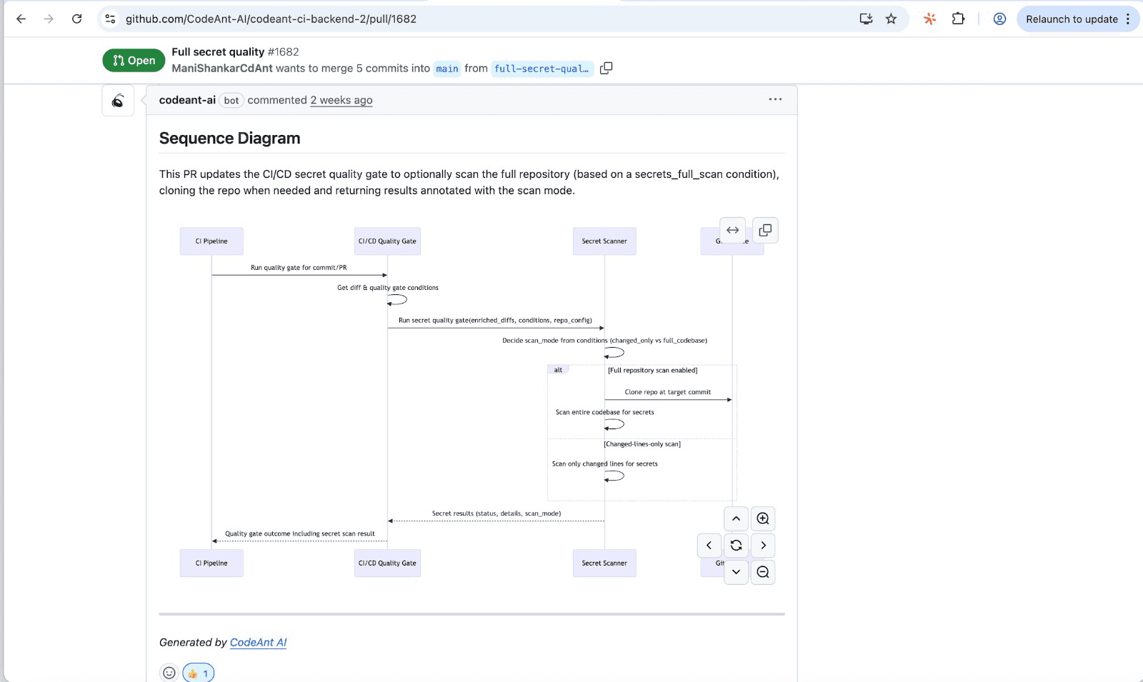
AI reads diffs and produces natural language summaries of runtime impact. Instead of "added 47 lines to checkout.js," you get "introduces retry logic for failed payment attempts, with exponential backoff up to 3 retries." CodeAnt AI generates summaries like this automatically during PR review.
Highlighting high-risk paths automatically
AI identifies error-prone patterns, performance bottlenecks, and security-sensitive flows. High-risk areas get flagged for human attention, so reviewers focus energy where it matters most rather than scanning every line equally.
Producing natural language explanations of runtime impact
Technical flow data translates into plain-English explanations. Reviewers understand impact without reading every line or mentally simulating execution.
Tip: CodeAnt AI generates sequence diagrams for every PR, focusing on the primary entry point, downstream modules, external dependencies, and critical transitions like validations and error paths.
Benefits of Flow Visualization for Engineering Teams
The practical outcomes of PR flow visualization compound over time:
Faster code reviews: Visuals communicate faster than text—reviewers grasp changes in seconds rather than minutes
Earlier bug detection: Seeing execution flow reveals logic errors, missing error handling, and edge cases that text diffs hide
Smoother developer onboarding: New team members understand codebases faster when they can see how components interact
Reduced cognitive load: Experienced engineers spend less mental energy building mental models
Choosing the Right Visualization for Your Workflow
Not every team requires every visualization type. Matching tools to your specific context avoids complexity without benefit.
Matching diagram types to PR complexity
Use sequence diagrams for service interactions, flowcharts for complex conditional logic, and dependency graphs for large refactors. Simple PRs might not require visualization at all—save the tooling for changes where it adds real value.
Aligning with team size and review cadence
Small teams with straightforward codebases might use simpler tools or generate diagrams on demand. Large organizations with high PR volume benefit from automated visualization integrated into every review.
Integrating with GitHub, GitLab, Azure DevOps, and Bitbucket
Visualization tools work best when they plug into existing workflows without context switching. Look for native integrations that embed diagrams directly in PR comments or dashboards. CodeAnt AI integrates with all major Git platforms and appears in their respective marketplaces.
How to Add Flow Visualization to Your PR Process
Implementation doesn't require a massive overhaul. Start with practical steps.
Evaluating standalone tools vs unified platforms
Point solutions handle single-purpose diagramming. Unified platforms like CodeAnt AI include visualization alongside security scanning, quality checks, and metrics—reducing tool sprawl and context switching.
Connecting visualization to CI/CD pipelines
Trigger visualization generation on PR creation. Diagrams appear automatically in PR comments or dashboards, so reviewers see them without extra steps.
Measuring impact on review velocity and defect rates
Track review time and post-merge bugs before and after adoption. CodeAnt AI includes built-in dashboards for tracking review metrics over time.
Moving Toward Smarter Pull Request Reviews
PR sequence visualization transforms code review from a text-parsing exercise into a comprehension task. Instead of mentally simulating execution across multiple files, reviewers see the runtime flow directly. The result: faster reviews, earlier bug detection, and better shared understanding across the team.
As codebases grow more complex and distributed, the gap between "what changed" and "what happens" widens. Visualization bridges that gap, turning sequence diagrams into a living changelog of how core flows evolve over time.
Ready to see how your code changes affect runtime behavior? Try CodeAnt.ai today!
FAQs
What is the difference between static and dynamic code visualization?
Can PR sequence visualization work with microservices architectures?
How much overhead does runtime flow analysis add to code reviews?
Do developers need to instrument code to generate execution visualizations?
How do sequence diagrams differ from call graphs in PR reviews?