AI Code Review
How Runtime Diagrams Solve the Pull Request Review Bottleneck for Senior Engineers

Sonali Sood

Founding GTM, CodeAnt AI
It's 3 PM on Thursday, and you're staring at a 47-file pull request that touches authentication, payment processing, and three microservices. The diff tells you what changed—but not how the system actually behaves with those changes. You're mentally tracing execution paths across files, holding function signatures in memory, and hoping you don't miss a hidden dependency that breaks production.
Runtime diagrams solve this problem by visualizing code execution flow directly in your PR review. Instead of building a mental model from scattered code fragments, you see which components interact, in what order, and where the critical decision points occur—all in one view.
This guide covers how runtime diagrams accelerate reviews for senior engineers, when they deliver the most value, and how to integrate them into your existing GitHub, GitLab, Azure DevOps, or Bitbucket workflow.
Why Pull Request Reviews Become Engineering Bottlenecks
Runtime diagrams give senior engineers a visual, high-level overview of code changes. Instead of mentally tracing execution paths across multiple files, you see which components interact, in what order, and where key decision points occur. The diagram acts as a map—immediately highlighting affected modules and how data or control flow changes.
The bottleneck problem is real. Senior engineers often juggle five or more open PRs while handling architecture decisions, mentoring, and incident response. Every context switch costs significant refocus time, and traditional text-based diffs don't reveal how code actually behaves at runtime.
Here's what typically slows reviews down:
Context switching: Reviewers bounce between PRs and lose focus on each one
Mental simulation: Engineers trace code paths in their heads across multiple files
Hidden dependencies: Text diffs don't show which downstream services or modules are affected
Large changesets: PRs touching 20+ files overwhelm even experienced reviewers
The result? PRs sit in queue for days. Developers wait. Releases slip. And when reviews finally happen, they're often rushed—missing architectural issues that surface later in production.
What Are Runtime Diagrams in Code Review
A runtime diagram is a visual representation of how code executes. It shows function calls, data flow, and component interactions as they happen during actual or simulated execution. Think of it as a map of your code's behavior, not just its structure.
For every PR, a well-designed runtime diagram captures the core execution flow introduced or modified by the change. It shows which modules interact, in what order, and where key decision points or side effects occur. Rather than drawing the entire system, effective diagrams compress the view to the PR's "happy path" plus the highest-risk branches.
How runtime diagrams differ from static code analysis
Static analysis examines code structure without running it. Runtime diagrams show what happens when code executes. Both are valuable, but they answer different questions.
Aspect | Static Code Analysis | Runtime Diagrams |
What it analyzes | Code structure and syntax | Execution paths and behavior |
When it runs | Before code executes | During or simulating execution |
What it reveals | Bugs, style issues, vulnerabilities | Dependencies, call chains, data flow |
Best for | Catching known patterns | Understanding dynamic behavior |
Static analysis tells you what the code looks like. Runtime diagrams tell you what the code does.
Types of runtime diagrams for pull request visualization
Several diagram types help reviewers understand PR behavior:
Sequence diagrams: Show the order of function calls between components—the most common type for PR reviews
Call graphs: Map which functions invoke other functions across the codebase
Data flow diagrams: Trace how data moves through the system from input to output
Dependency maps: Visualize which modules rely on each other
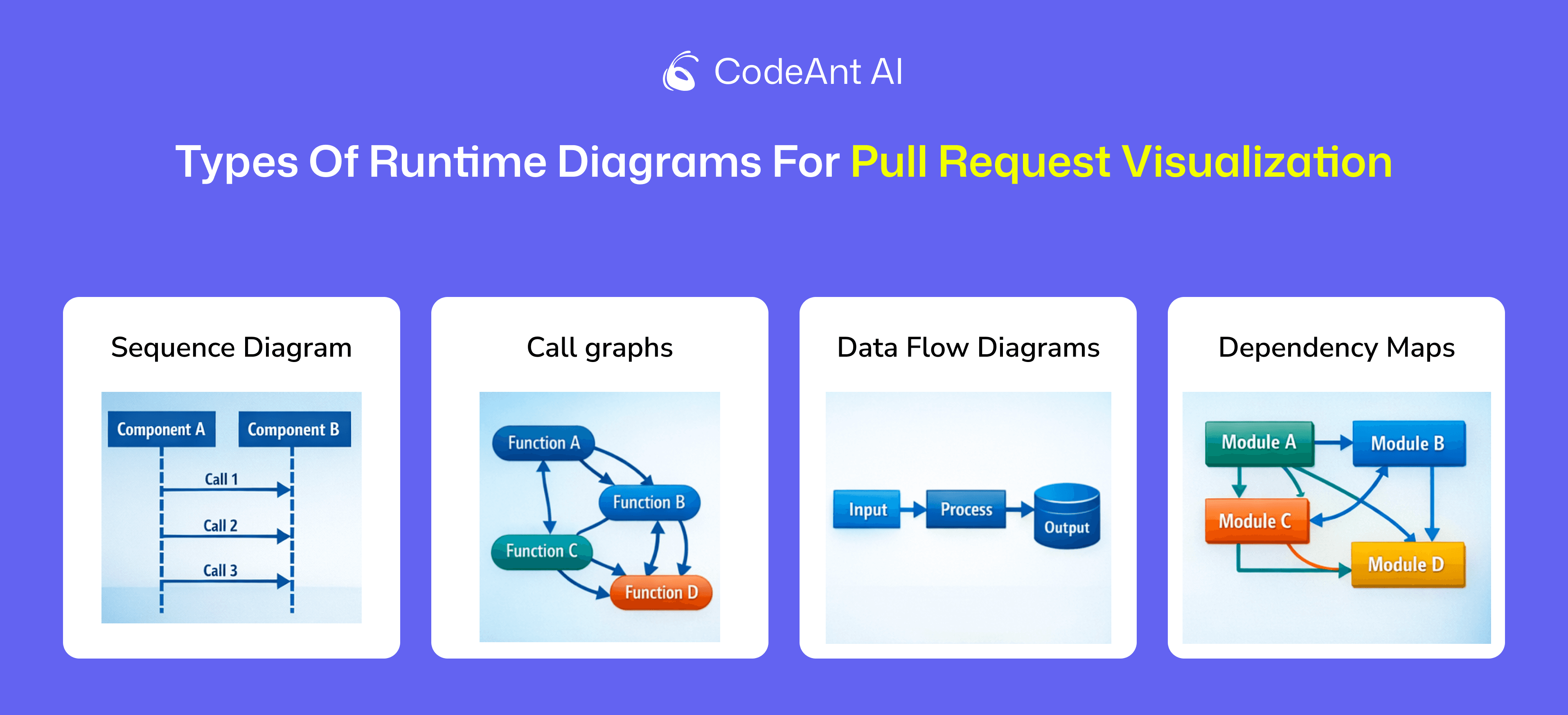
Sequence diagrams tend to deliver the most value for PR reviews.
They capture the primary entry point (API handler, job, or event consumer), downstream modules, external dependencies (database, cache, queue, third-party APIs), and critical transitions like validations, authorization checks, and error paths.
How Runtime Diagrams Accelerate Code Reviews for Senior Engineers
The acceleration comes from shifting cognitive load. Instead of building a mental model from scattered code fragments, reviewers see the execution flow immediately.
Visualizing execution flow across multiple files
A typical PR might touch files in /api, /services, /repositories, and /utils. Without a diagram, you're jumping between tabs, holding function signatures in memory, and mentally stitching together the call chain.
With a runtime diagram, you see the entire flow in one view. The API handler calls the service layer, which validates input, queries the database, and returns a response. All visible at a glance. Senior engineers responsible for system integrity can instantly confirm that new code integrates correctly within the broader architecture—without tracing every line manually.
Surfacing hidden dependencies and side effects
Text diffs hide connections. A change in one module might affect caching behavior, trigger downstream webhooks, or introduce race conditions in concurrent operations. Side effects don't appear in the diff itself.
Runtime diagrams expose connections explicitly. You see that the new validation logic calls an external service, which adds latency. You notice that the error handler now writes to a different queue. Insights like this prevent production surprises.
Eliminating mental simulation in complex reviews
Senior engineers often describe code review as "running the code in your head." For simple changes, that's manageable. For complex PRs involving concurrency, distributed systems, or security-sensitive paths, mental simulation becomes error-prone and exhausting.
Diagrams replace simulation with observation. Instead of inferring behavior, you see it. This frees cognitive resources for higher-level concerns: evaluating logic, verifying design principles, and mentoring the PR author on best practices.
When Runtime Diagrams Deliver the Most Value in PR Reviews
Not every PR benefits equally from runtime visualization. Here's where diagrams provide the biggest acceleration.
Large pull requests with cross-cutting changes
PRs touching many files benefit most. When a change spans multiple layers—API, business logic, data access, and infrastructure—diagrams show the full blast radius. Reviewers immediately see which components are affected and how changes propagate.
Microservices and distributed system updates
In microservices architectures, a single PR might affect service-to-service communication across multiple repositories. Runtime diagrams reveal interactions between services, showing how data flows and where failures might cascade.
Security-sensitive code modifications
For changes involving authentication, authorization, or sensitive data handling, diagrams expose the data flow through security-critical paths. You can verify that user input is validated before reaching the database, that tokens are checked at the right points, and that sensitive data isn't logged or exposed.
AI-powered code review platforms like CodeAnt AI combine runtime visualization with security scanning—flagging vulnerabilities while showing exactly where they occur in the execution flow.
Reviews in unfamiliar codebase areas
Even senior engineers don't know every corner of a large codebase. When reviewing code in modules they didn't write, diagrams reduce ramp-up time dramatically. Instead of reading documentation or asking the author for context, reviewers see the behavior directly.
Best Practices for Using Runtime Diagrams in Your PR Workflow
Adopting runtime diagrams doesn't require overhauling your workflow. A few targeted practices deliver immediate value.
1. Generate diagrams automatically in your CI pipeline
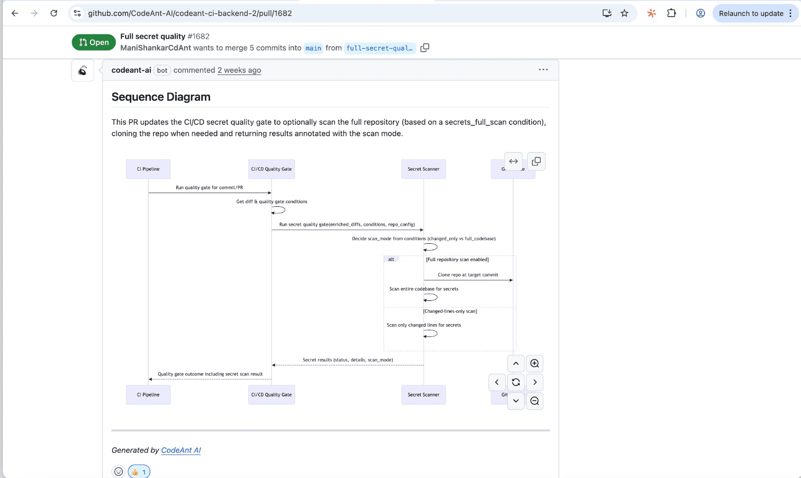
Manual diagram creation doesn't scale. Configure your CI pipeline to generate diagrams for every PR automatically. AI-powered code review tools handle this without additional developer effort—analyzing code changes and producing sequence diagrams as part of the review process.
2. Focus visualization on changed code paths
Full system diagrams overwhelm reviewers. Effective PR diagrams focus on the execution paths affected by the change—the primary entry point, modified functions, and downstream dependencies. This keeps diagrams readable and relevant.
3. Combine runtime diagrams with AI-powered review summaries
Diagrams show what happens. AI summaries explain why it matters. Pairing both gives reviewers visual and textual context. CodeAnt AI generates both automatically—a sequence diagram plus a crisp summary highlighting what changed and what to watch for.
4. Use diagrams to document review decisions
Save diagrams as part of PR history. When someone asks "why did we approve this change?" six months later, the diagram explains the decision. This documentation proves valuable for audits, onboarding, and debugging production issues.
5. Integrate visualization into existing GitHub or GitLab workflows
Diagrams lose value if they live in separate tools. The best implementations surface diagrams directly in PR comments or dashboards—no context switching required. Look for tools with native integrations for GitHub, GitLab, Azure DevOps, or Bitbucket.
How to Measure Runtime Diagram Impact on Review Efficiency
Engineering leaders want data, not anecdotes. Here's how to track whether diagrams improve your review process.
Track review cycle time improvements
Review cycle time measures how long PRs wait for review and approval. Shorter cycles indicate faster reviews. Compare cycle times before and after adopting runtime diagrams—most teams see meaningful reductions for complex PRs.
Monitor defect escape rate reduction
Defect escape rate tracks bugs that reach production despite code review. Fewer escapes suggest more thorough reviews. Runtime diagrams help reviewers catch architectural issues and hidden dependencies that text-based reviews miss.
Assess time to first meaningful review comment
This metric captures how quickly a reviewer engages with substantive feedback—not just "LGTM." Faster first comments indicate that reviewers understand the change quickly. Diagrams accelerate comprehension, which accelerates engagement.
Ship Faster Code with AI-Powered Pull Request Visualization
Runtime diagrams transform code review from a bottleneck into a competitive advantage. Senior engineers spend less time tracing code paths and more time evaluating design decisions, mentoring teammates, and shipping features.
The most effective implementations combine diagrams with AI-driven analysis—auto-generated sequence diagrams, security scanning, quality checks, and actionable summaries in a single platform. This approach standardizes the review process, making it faster and more consistent across teams.
By generating a per-PR artifact that captures the core runtime flow, teams create a living "change log" of how critical flows evolve over time. Reviewers can immediately identify what changed, where it propagates, and what could break. Wanna deep dive and accelerate your pull request reviews? We strongly recommend you try CodeAnt.ai at app.CodeAnt.ai today!
FAQs
What are runtime diagrams in code reviews?
What tools automatically generate runtime diagrams for pull requests?
Can runtime diagrams integrate with GitHub, GitLab, and Azure DevOps?
Do runtime diagrams add overhead to CI/CD pipelines?
Are runtime diagrams useful for reviewing small pull requests?